︎
Design
Art
About
Contact
Cart*
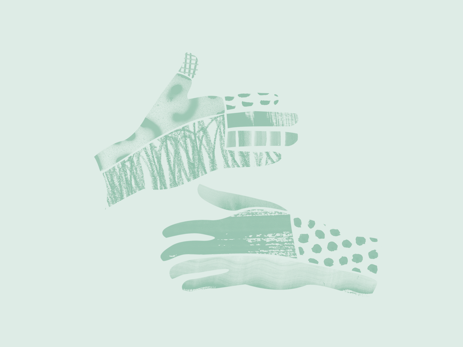
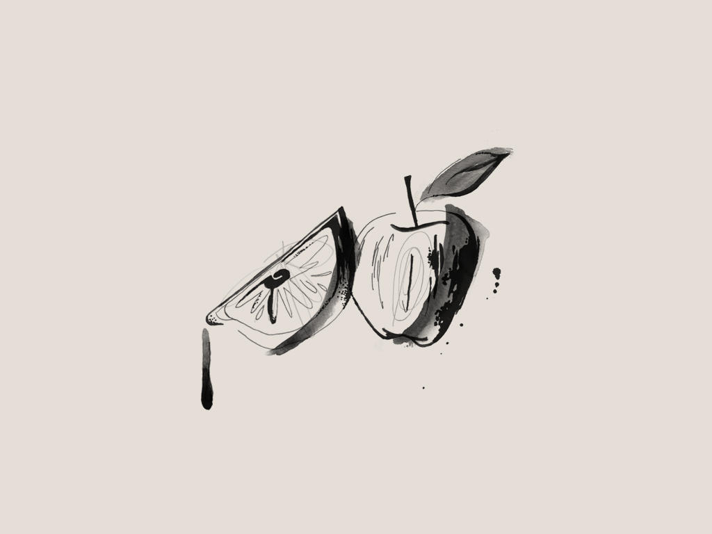
A multidisciplinary designer and
visual artist
focused on creating and nurturing brands through illustration, artwork, lettering, branding, and pattern design using a variety of both digital and analog mediums.
Select Clients
Microsoft
,
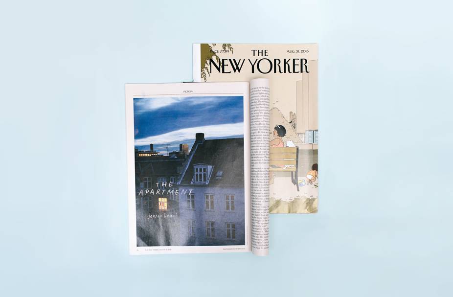
The New Yorker
,
Adobe
,
Edelman
,
Plum Organics
,
Victoria’s Secret
,
Artifact Uprising
,
Creme Collective
,
La Mer
,
Ban.do
Creative Market
Instagram
Dribbble
Pinterest
Twitter
hello@evablack.studio
@evablack_